Let’s not be in denial here, the 90s ended 2 decades ago. Whilst the mother of some of life’s great wonders – Pokémon on VHS, Tamagotchis & The Macarena to name a few – you cannot deny that there are just some things about the 90s that should honestly best left on the Wayback Machine. Take the bowl haircut, Clippy, and just generally god-awful outdated website design as some charmingly regrettable examples. ????
From keeping up with the latest design trends to ensuring that your website serves each visitor with the information they seek, if you are serious about utilising digital marketing as a lead generation channel, your business has an obligation to remain informed. If you’re looking to revive the once-thriving presence of old, oh boy, do we have just the tips for you. Discover whether you have an outdated website design that’s in serious need of some TLC.
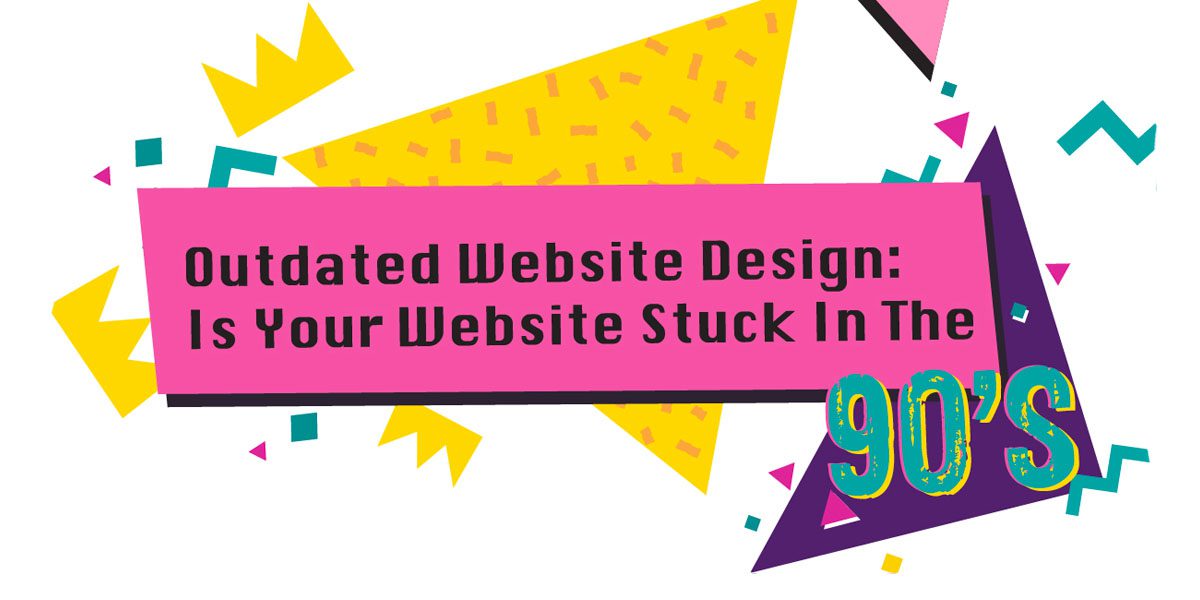
7 signs you have an outdated web design
It may be nostalgic, but a total hits counter on your website is just not required. In fact, most website design projects today are collecting dust as poorly-designed relics of the not-too-distant past. But if your website was one of them, how would you know? Whether it be a rainbow colour scheme, a data feed on Myspace, or extremely short pages, take a look at our top 17 reasons why your outdated web design needs an overhaul.
1. Your website has a hit counter.
Nostalgic as it may be, a total hits counter on your website is just not required in 2019. Okay, we have to admit that whenever we see a total hits counter we sit back and relish at the figures for a while but again, it’s just not required for your business. There are many other ways to signal your businesses popularity and we suggest replacing your counter a total number of customers your business services, your total review count, or social media followers instead.
2. Your website uses whacky fonts.
Seriously, Comic Sans and Papyrus are best dressed with an invisibility cloak. If your website is still making use of whacky fonts, you definitely need to start exploring new options as soon as possible. Don’t forget that Google also benchmarks your website on its readability. You bet that whacky fonts are not at the top of Google’s wishlist.
“This is a public announcement for Mr. Comic Sans. Please make your way to the nearest trash bin; immediately!”
3. Your website looks like a rainbow.
Website design colour palettes have long since surpassed what you’ll find on Microsoft Paint 1992 edition. Whilst it’s common practice to highlight your most critical assets, such as a call to action, in bright colours, if your website looks like a paddock of unicorns, you should really think about toning this down – A lot!
4. You welcome visitors with ‘Enter Here’
Remember when you’d visit an outdated website design and would be greeted with ‘Welcome to Dave’s Hub – Enter Here’? Yeah, that’s no longer acceptable. Entry pages today only really have a place where they assist the user experience. Take multinational companies for example. If you provide your visitor with the option to view country-specific content based upon there location, then fire away with your entry page!
5. Your website uses too much stock photography.
Stock photos, when used well, are a cost-effective way to bring richer media to your website. However, when used poorly or with too much density, your business quickly starts to look like every other dime-a-dozen business. “Strange, I swear I’ve seen that guy in 45 other business’ work photos…”
6. Your website auto-plays music.
A lot of websites in the late ’90s and 2000s were guilty of god-awful auto-play music, in particular, MIDI-files. Unless the visitor to your website had their systems volume on mute, you can be sure they jolted into a frantic noise-control mode when accidentally landing on your website. Many websites also did not include volume controls either – bummer! Fast forward to today where silence is golden and users aren’t being bombarded and held captive by what you consider to be the soundtrack to their experience.
7. Your website is stuffed with keywords.
In the early days of SEO, your website stood a great chance of ranking well on Google simply by stuffing as many keywords into your content as possible. I mean, who really cared how the content read if you were repping prime real-estate on Google search for your major keywords?
Today, that is not the case. If your content reads like a white pages business directory, you should be investing in professional copywriting services immediately!
8. Your website hides content with white text.
As an extension of the above, smart SEO companies back in the ’90s would write great content for the user to read and then leave huge blank spaces underneath. When I say blank, I mean that the content was written in white font on top of a white background! By simply highlighting the white space you’d often find an array of keywords stuffed!
”An SEO professional walked into a bar, bars, bar near me, bars Melbourne”
9. Your website uses flash.
What once was a revelation of new design opportunities, Flash websites quickly fizzled out around the mid-2000s. As users became frustrated with constantly having to update their version of Flash to even access a website, you can see why Google blocked flashed content altogether in 2016! If your website is still using flash then chances are that you will never be found on Google by those using Google Chrome – (Which is a lot of people by the way!)
10. Your website is not mobile responsive.
Whilst not necessarily a strong requirement of the 90s, a mobile responsive website is paramount to being successful today. With most websites now showcasing larger traffic from mobile devices over desktop, if your website is not mobile responsive, then get on to this quickly. The same can’t be said for all industries, with some still repping a strong desktop presence. Do your research and find out how your target audience prefers to view your content.
11. Your website has lacking features.
In the ’90s, websites did not feature many widgets or rich tools as the technology was not available. However, if your website still looks like a blank piece of A4 paper, we implore you to start looking at ways to bring additional interactivity. Not only will your users be more engaged in your content, but you may also find yourself acquiring more leads if you pick the right tools.
12. Your website has too many widgets.
Don’t get confused and assume that lots of links and widgets on your website will improve your SEO rankings. While SEO internal links do play a part in your overall SEO presence, too many links and widgets both hamper your page load speed and also the usability of your website. For each link you place, your website has to download the content of that link and, therefore, will take longer to load. A good rule of thumb is to only link what is absolutely necessary and relevant to your content.
13. Your website uses clipart graphics.
You’d be hard-pressed to find a website that still uses clipart graphics today, however, what we mean by this is that you’ve literally gone to Google and picked the first graphic you could find without any thought for your brand. Poor graphics result in poor engagement and if your website’s graphics are not up to scratch; say hello to a high bounce rate!
14. Your navigation bar shuffles.
Ever been on a website where the navigation bar shuffles depending on what page you are viewing? Yeah, that’s pretty ugly. A tell-tale sign that you have an outdated website is your navigation bar getting its jiggy on when you are surfing your content. After all, new innovations in technology require consistent upgrades if you hope to cater to varied devices.
15. Your website is coded in frames.
As ugly as they were, frames within a website made some form of sense as a simple way to break up your content into sections. However, now that websites are advanced enough to serve content into sections by themselves, there is absolutely no need to use frames anymore.
16. Your website uses bevel and emboss.
No. Just don’t go there. Bevel and emboss is possibly the most hideous digital design trend that ever walked this earth. Let’s leave this to our good friends in printing who actually know how to make good of embossing images or logos.
17. Your website has high bounce rates.
If you have reached this section and are wondering why your bounce rate is so high even though you don’t possess any of the outdated website design trends above then you still need to look at overhauling your presence. Your bounce rate is symbolic of how users are engaging with your content and anything above 50% needs serious attention. Perhaps you are not addressing their needs? A slow page load time maybe? Or maybe your offering is just not sticky enough? Either way, revisit your landing pages and devise a new strategy.
How can an outdated web design negatively affect your business?
A poorly-designed, outdated website is almost as bad as having no website at all. In a world that judges first and explores later, your website is the single presence you have to showcase your business. You might be the best salesman in the world or have the best offer in your industry. However, if your website doesn’t cut the mustard and leave the visitor with a sense of trust, security and excitement, then you’d better start thinking about a website redesign.
Here are 5 reasons why an outdated web design may be hurting your business.
1. Your website could be faster.
In a world of less haste, more speed, the load time of your website is absolutely paramount to ensuring that your visitors remain engaged. By utilising outdated website design trends and technology, chances are that your website is not the Ferrari it once used to be. Test your website speed to see if all pages load under 3 seconds is well on its way to improved engagement.
2. Your presence could be stronger.
Outdated website design is a fast-track to weak visibility on Google. Take our friend flash for example. Any flash content is blocked by Google Chrome and therefore not indexed. If your website also uses keyword stuffing then we’d also tip that your domain name has been penalised as well! For every position you go back on Google you are losing out on a huge chunk of traffic so sharpen up your presence.
3. Your business could look incredible.
Even if your presence is strong and your website loads quickly, garish design immediately throws doubt into the credibility and relevancy of your business. You’d be sure to put your best suit or dress on for that wedding you’re going to attend in a few months time, so translate this into how people judge your business online as well. Make your business look incredible by keeping up with design trends.
4. Your business could be more trustworthy.
With so many businesses competing for the same market, falling short on website speed, visibility and credibility will immediately generate a lack of trust. Psychologically, people assume that the websites at the very top of Google are the biggest and best. It’s not always the truth but the trustability of your business can be improved by remaining on top of website design trends.
5. Your business could grow faster.
By fixing all the above, improving your website load time and creating landing pages that funnel each visitor into enquiring, your business can grow much faster. Your website is your 24/7 salesman who never wants annual leave and very rarely takes a sick day. Fuel this salesman with as much ammo to fire new opportunities into your inbox and be on your way to a thriving business!

Leave A Comment