If you think that the colours that represent your brand are just splashes on a page, you would be mistaken. Here’s how to choose brand colours and the importance of research when making the right choices.
Every business asks themselves at some stage how to choose brand colours. No matter whether you’re starting a new business venture or considering a rebrand of your current presence, one of the hardest, yet most important, parts of branding is finding the perfect brand colour palette. That said, while selecting an ideal colour scheme for your brand logo and marketing materials may seem like a daunting task, with the right knowledge at your disposal, your choices can have a huge impact on how your company is perceived by your target audience.
In this article, we’re leaking our top tips on choosing brand colours and what you need to consider before making that all-important design. Discover examples of successful colour combinations from various companies as well as ways to keep your branding consistent once you’ve decided upon your brand colours.
Ready to dive in and learn how colours can affect your brand? Let’s get started!
Below are a number of tips on how to choose your brand’s colour palette, examples of successful colour combinations from various companies as well as ways to keep your branding consistent once you’ve decided upon your brand’s colours.
How to choose brand colours (5 Steps).
You may be interested to know that more often than not the colours you choose for your brand can be much more important than individual design elements and imagery. If you find that hard to believe, imagine some of the world’s most prominent brands or even just your personal favourites. Can you immediately draw their logos from memory? Probably not. You will however be able to remember their brand colours.
As mentioned above the colours you choose for your brand are of utmost importance and can have a huge impact on how your audience views your business. Below are five simple steps on how to decide which colours are right for your brand.
#1 – Establish your identity and core values.
Don’t make the mistake of jumping straight into perusing colour swatches or designing a logo before you’ve established your identity and values. Ask yourself the following questions:
- Who is your target audience?
- What are you offering your target market?
- Why did you start your business and is there a story behind this?
- How do you want your target audience to feel?
- Who are your competitors?
Answering the above questions with 2-3 emotive words is a great way of beginning to understand and identify your brand identity. Of which, this ultimately leads to you choosing brand colours that are right for your business. Is your identity light-natured and casual? Or, are you more corporate and serious? Defining your identity will immediately bring certain brand styles to the fold.
–
#2 – Research colour psychology.
Different colours can evoke different emotions. So, it’s absolutely paramount that you research and carefully consider the psychology of colours. It’s important to note that the meaning and psychology of colour is not universal and can differ depending upon cultures or geographical locations. For example, the colour red symbolizes love and passion in many countries throughout North America and Europe. However, in Africa, red symbolises death and grief. You wouldn’t want to get that one wrong!
As well as taking into account your answers relating to your brand identity, ask yourself if you intend to showcase your brand internationally or not. Are there colours that have strong cultural connotations? Are you aiming for a gender neutral brand or are you targeting specific genders? Is your brand’s tone of voice going to be authoritative, comforting, fun, informal, inspiring? How do you want your audience to feel whilst viewing your brand?
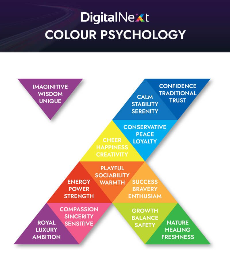
These are all very important questions to ask yourself so that you begin looking at individual colours and the emotions they can evoke. These emotions may change depending on the different tone or hue of the colour with yellow being a perfect example of this. Bright yellow can make us feel happy, energetic and is even said to increase our metabolism (hence why it’s used for those famous golden arches). On the flip side, too much bright yellow can be overstimulating and irritating. And pale or darker shades of yellow have negative connotations to depression, cowardice and sickness.
Once you begin to learn how certain colours may make your customers feel, you’ll gain a better understanding of which colours will be best suited to your brand. As another example, let’s take a look at the health and wellbeing sector. You will notice that this sector is often associated with the colour green. Green is a colour which is abundant in nature and therefore symbolises growth, renewal, peace and tranquility making it an excellent choice for brands trying to promote these qualities to their potential customers.
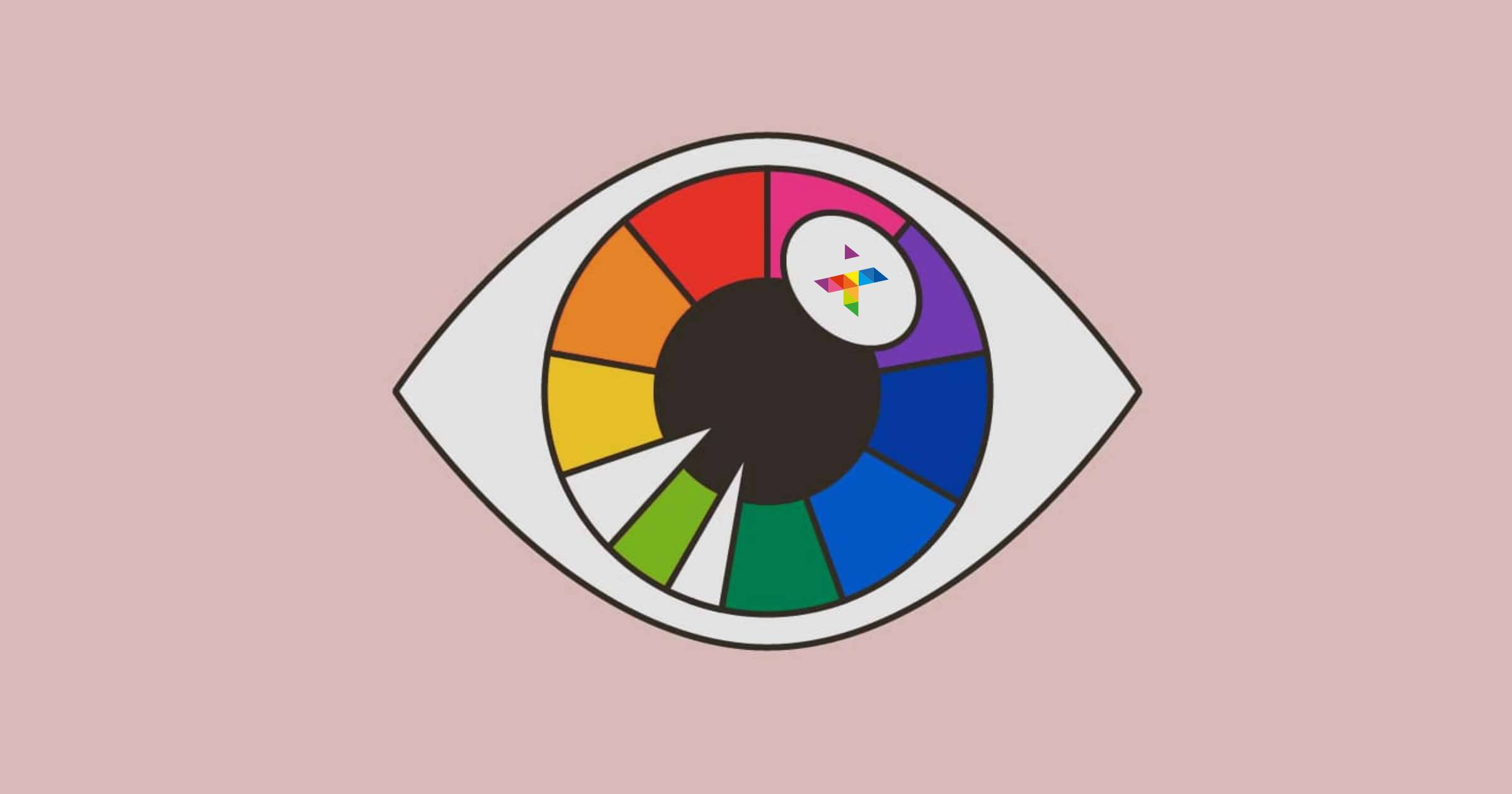
Using our own logo and colours, below are some of the words associated with these colours and the feelings or emotions they can evoke.
#3 – Create a visual mood board.
Once you’ve answered all the questions above and gained an idea of what colours you wish to align to your brand (as well as considered how they may make your customers feel), it’s time to get creative.
A mood board is one of the best ways to visually display your answers to the above questions using visual assets such as colour swatches and images. You can either create a mood board physically or digitally depending on your preference. Find a colour you’re considering and pair it with images that heavily feature that colour. Websites such as pinterest are great for creating mood boards as you can search not only certain colours but also use descriptive words to find images that resonate with your brand’s personality.
Pro Tip: Don’t limit yourself to just one board!
Have fun and experiment by building different boards featuring different colours or tones. When finished, your final mood board should communicate your brand’s core values (albeit in a very basic fashion). If the board doesn’t, then you may need to rethink the colours.
If you are unsure whether your mood boards express your chosen emotions effectively, now is the perfect time to reach out to your peers or even do some market research to figure out which of your mood boards best display your brand image.

#4 – Select your primary and secondary colours.
A successful brand colour scheme features more than a single colour so it’s time to decide upon a colour; not only as your core colour but also a secondary colour to compliment. Your secondary colour may be simply black, grey or white. However, when you are needing inspiration, look at existing brands and how they pair their primary colour with a secondary colour.
You will notice that many of the most successful brands keep their branding very strong by using a limited colour palette. Here, they use two colours that not only complement each other, but contrast enough to make their branding extremely eye-catching.
Good examples of two-colour palette brands are Netflix using their signature red on black, Coca-a-cola red on white or the Adobe logo, which is actually white yet stands out on a strong red background.
#5 – Experiment with colour palettes
Once you have chosen a primary and secondary colour for your brand, time to expand on these colours to create a colour story or palette. Using a colour palette generator is the best way to quickly and effectively find colours that match your primary and secondary colours.
Many online palette generators such as Adobe Kuler will allow you to input your chosen colours and suggest a number of complementary colours. Be sure to take note of any colour codes such as Pantone or HEX codes so that you can reference your chosen colours correctly in future.
When doing this, be mindful that adding other colours to your story can affect the way in which your primary colour is perceived. You may therefore wish to expand your colour palette by simply adding more neutral colours or different shades of your primary colour.
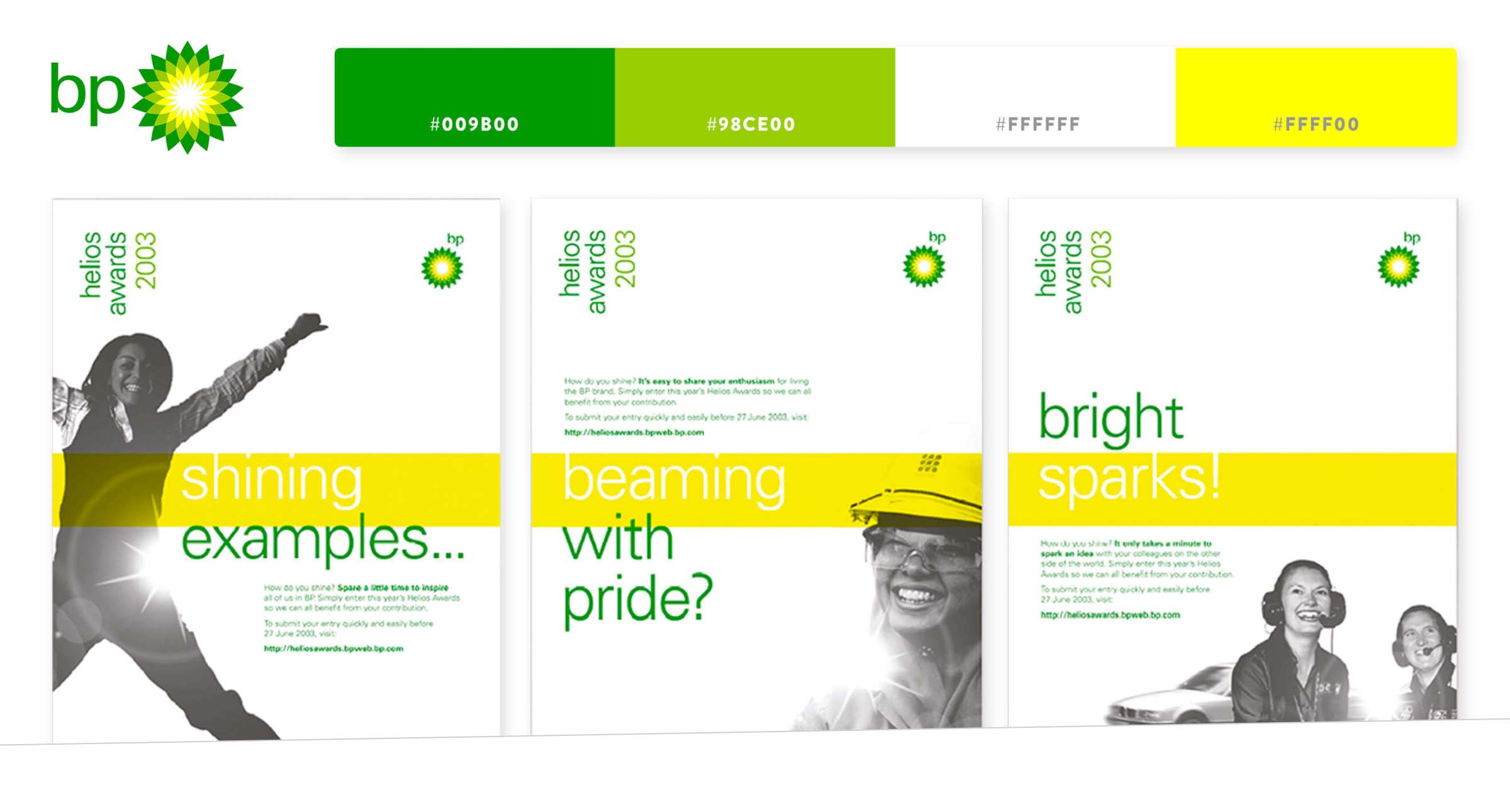
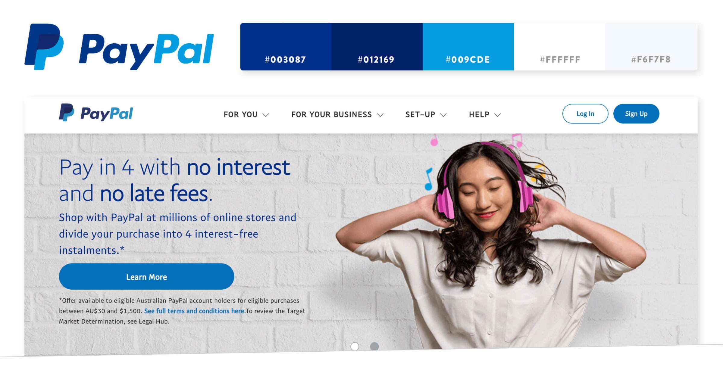
Again, look to existing brands for inspiration on how they use different colours to convey their brands personality effectively. BP and Paypal are also both excellent examples of brands successfully using a fairly limited colour palette to portray their brand values.
BP Colour Palette
Although having a limited colour works extremely well when creating a strong brand image, there are often times when additional colours may need to be introduced. This is why having a secondary colour palette is important. Whilst the colours within your entire secondary palette may not be featured in your logo, you may wish to use additional colours in order to differentiate important key points such as key messaging or call to action buttons.
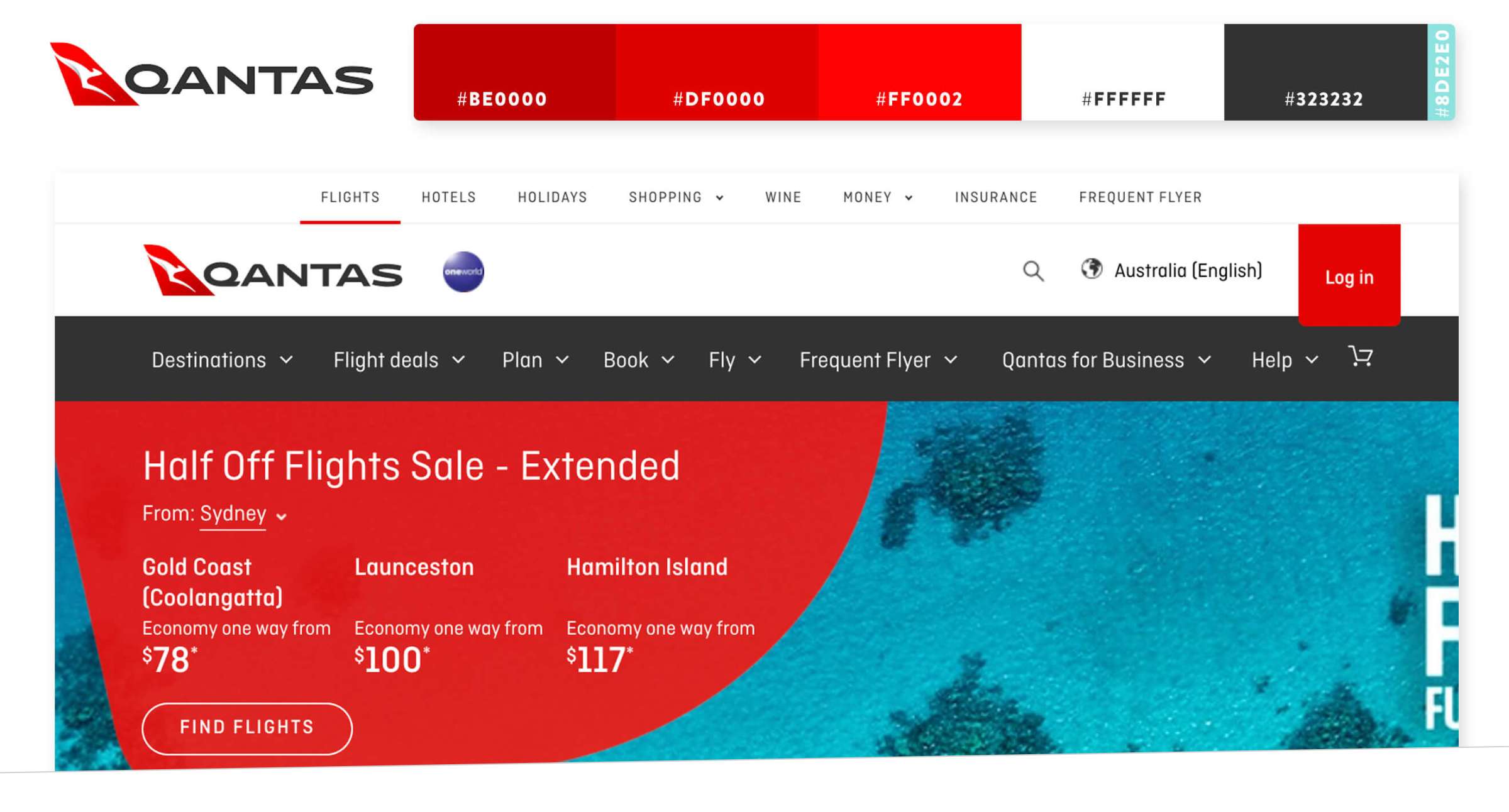
A good example of a brand introducing contrasting colours outside of their core brand colours is Qantas. Although the baby blue shade isn’t featured on their logo, it’s used throughout their marketing and website design to highlight key points such as special offers or sale prices. In order to tie this contrasting shade into their brand aesthetic, it’s also featured in some of the brands’ imagery.
It can often be beneficial to include contrasting additional colours when creating any sort of visual advertising or social media advertising creative posts. This also extends to your website where contrasting colours could be used for the call to action buttons or certain fonts. Sticking to this “secondary colour palette” in any instance where your primary core brand colours cannot be used is a sure-fire way of maintaining brand identity whilst ensuring your brand remains consistent and easily recognisable.
Once you’ve set yourself up for success by perfectly choosing brand colours, it’s time to apply the colours within your brand’s colour story effectively. You can now use your brand colours for your logo, website, social media, advertising and any other design related matter. Using your colour palette throughout all of your marketing material is a sure-fire way of making your brand easily recognisable to your target market. By sticking to your chosen colour palette when creating any type of visual representation you will keep your brand’s personality consistent no matter what you create in the future.
How to maintain consistent branding?
By now, you’ve recognised that choosing brand colours is going to take some effort. So the last thing you want to do is not maintain your brand consistency. Yes, we said that choosing the brand colours is one of the important parts of your branding strategy. However, sticking to your chosen colour palette and maintaining a consistent brand aesthetic over time can also be particularly challenging – especially when you have more than one person working behind the scenes.
Below are a handful of tips that will help you maintain consistent branding. In turn, maintaining your brand will enable you to deliver a visually appealing and consistent message that your intended market will find easily recognisable.
#1 – Create a brand bible.
One way of ensuring you stick to your chosen palette and keep your brand’s image consistent is to create a brand style guide. Think of your style guide as a branding bible, including everything anyone would ever need to know when it comes to how your brand should be visually represented.
As well as the all-important colour palette (including HEX codes or other colour references), your logo, brand mission, tone of voice and typography, your brand guide can also include anything else you feel will help to keep your brand’s identity consistent.
This is especially important when it comes to designing your website. Imagine, you hire a website designer that is not privy to your brand bible. Poof, say goodbye to your brand consistency almost immediately.
#2 – Organise brand assets.
Having your brand’s visual assets well organised is another way to make maintaining brand consistency’ a simple and easy task. Through well organised and specific folders on either a remote application such as Dropbox or even a hard drive, you will enable anyone who is working on your brand to quickly and easily find what they need when creating any sort of content. Being able to locate the correct files quickly means there’s less risk of designers or content creators straying away from your approved colours, fonts and styles. Therefore, diluting your brand’s aesthetic.
This is especially important if you have a large library of images or photography that you wish to incorporate into your branding. Organising and clearly labelling your files with products names, whether they are edited yet or not, or even if they are only to be used for certain applications is an excellent way of making it foolproof for outsiders to keep marketing material consistent and in keeping with your brands’ style guide.
#3 – Involve everyone in your team.
It’s easy for your core brand message, tone of voice and visual assets to get lost along the way, especially in larger organisations where multiple people are working on individual assets for your brand. That’s why, it’s paramount that you make sure everyone who works for your brand knows about your brands guidelines. Providing your staff with your Brand Bible and allowing them access to your professional organised visual assets is one of the simplest ways to ensure everyone is working from the same page.
#4 – Consider all platforms.
This may seem like common sense, however, it’s still worth noting that it’s important that you stay consistent between any and all platforms your brand features on. Print, digital assets, social media posts, TV ads and Radio Ads should all reflect your brand identity and feel consistent to your target market.
Again this is where well structured brand guidelines will come into play.
#5 – Oversee the approval process.
Lastly, one way to keep your brand image consistent is to oversee all of your brands content and have an approval process. If you’re a one man band or a small team this is of course a much simpler task than if you have a larger company. If you are part of a larger team or are planning to grow your business to a larger scale then it could be worthwhile to have a staff member or team of people to oversee and approve your content before anything goes live, ensuring that whatever is created fits in with your brand aesthetic.
Having a brand that isn’t consistent is a sure fire way to confuse your target market as well as creating lack of trust with existing clients or customers. Therefore, maintaining brand consistency is paramount to success. Having a brand that stays true to its signature style, tone or voice and key messaging looks professional and over time you’ll create a brand that’s easily recognisable and stands strong against market competitors.

Article by
Emily Holmes
Leave A Comment