 Free Strategy →
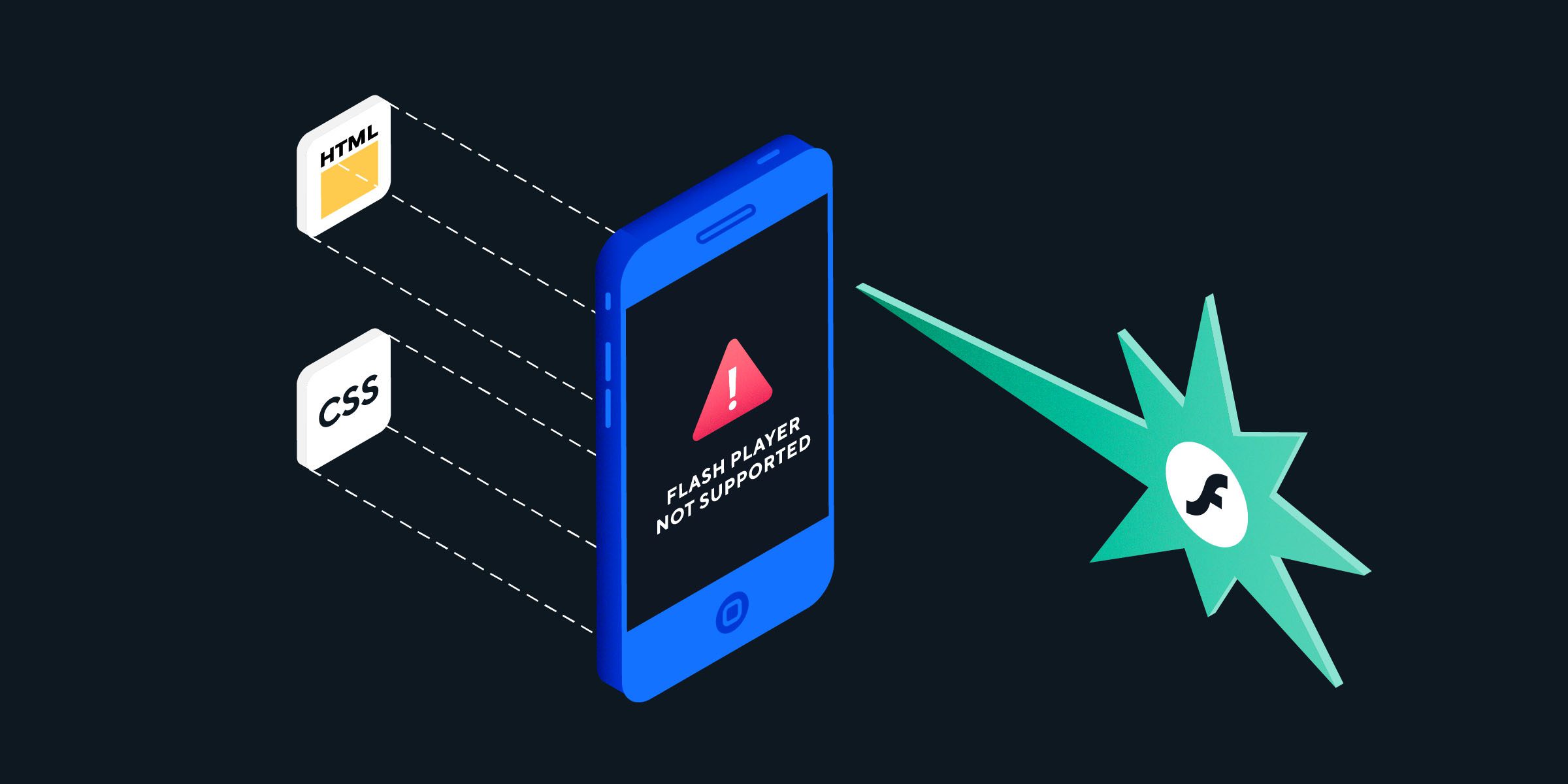
Website Design History Infographic
Web design encompasses many different skills and disciplines in the production and maintenance of websites. The different areas of web design include web graphic design; interface design; authoring, including standardised code and proprietary software; user experience design; and search engine optimization. Often many individuals will work in teams covering different aspects of the design process, although some designers will cover them all. Can you believe that the first website on the internet was published a whopping 25 years ago?
Web design has come a long way since then, so let’s go on a journey through the ages and see how what we have come to know as websites these days has evolved!
1990:
This is the dawn of the era of HTML coding. This is the first ever coding language designed to make web pages, and where it all started.
1991:
The first website is live on the web. Pages are text-based using only 16 colours. All web pages are in single columns and connected by a series of hyperlinks. This is viewed through the very first browser known to us as Nexus.
1993:
The first image is on a web page with the help of the world’s second browser, Mosaic. Web design starts to hear in the direction of wider layouts.
1994:
The World Wide Web Consortium (W3C) gets established. This enables web pages to load faster and at a higher resolution. To assist this, the browser Netscape launches.
1995:
The colours available to web designers grow from a measly 16 to 256. Fonts like Times New Roman and Courier New start popping up all over the internet. Simple animations also dominate designs via Macromedia Shockwave.
1996:
The now infamous Internet Explorer overtakes Netscape to be the most popular web browser. Web design begins to flourish as Cascading Styling Sheets (CSS) launches. This allows designers to be more adventurous in terms of layout.
1997:
There is a growing emphasis on navigation menus in designs. Designers begin to start using dark black backgrounds and colourful 3D buttons to link pages together.
1998:
Cascading Styling Sheets (CSS2) succeeds its CSS predecessor. This offers web designers opportunities to be more adventurous with their layout designs.
1999:
Internet Explorer 5 is born! Along with this comes web designers’ new fondness of gradient colours and the “page cut”. All these elements are in framed web pages. This becomes a popular way to keep a site’s navigation in place whilst you scroll up and down.
2000:
Web page content decreases in favour of more images and buttons on the page instead. Designers also shy away from too many vibrant and garish colours. They start using colours that create greater contrast and are more readable.
2001:
Designers begin to use the grid format for a more organised and user-friendly design.
2003:
The amount of colours that web designers can use again booms from 256 to an amazing 16,777,216! Drop down navigation menus start to become popular and replace the colourful button and framed navigation of the past.
2005:
Web page speed increases as videos are integrating into web designs. This happens at the same time as the launch of online video giant Youtube.
2006:
Designers start to use long scrolling layouts on their pages with stock photography. This makes their designs more user friendly and illustrates real-life concepts.
2007:
Drop shadows and skeuomorphism start to trend throughout websites all around the world. With more shadowing and textures, websites seem more like their “real-world” counterparts.
2008:
Mobile phones get their first mobile internet browser, Safari. Static designs start to decrease in popularity as designers make mobile versions of websites. This results in one web page becoming two, one static and one mobile.
2010:
Responsive design becomes huge as more people begin browsing the net on their mobile phones. Designers start to create mobile responsive designs. These work both as desktop and mobile sites instead of creating two separate websites.
2012:
Flat design begins trending across the web. Designers opt for more minimalist designs and colours to create a 2D effect. Web design becomes more about content and less about aesthetics.
2015:
Parallax design becomes more popular throughout the web. Foregrounds move master than the background when scrolling. This makes the web design an animation in itself!
2016:
Here we are today – Material Design uses shadow effects and the concepts of movement and depth in order to create designs that appear more realistic to the user. Bespoke website designers create clean, modernistic designs that focus on UX. Launched by Google in 2014, material design has been a game changer this year and is a trend that is definitely going to stick around.
_____
With the ever-changing times, we can only wonder what exciting things web design has in store for us the future!

Article by
Steven Lord
Steven Lord is an experienced digital marketing strategist with a lust for search. You'll find Steven on the front lines at Digital Next distilling some of our most complex digital marketing challenges or right here on our blog sharing marketing tips, tricks and insights.
Leave A Comment