Too much time is spent on your advertising creative and not enough time is spent on making sure your landing page is ready to convert swarms of people who you suckered into visiting via your advertising. But fear not. Our incredibly talented designers have concocted this infographic that explains exactly what you need to do to ensure you advertise with a high converting landing page. Scroll down to discover how to squeeze more revenue out of your advertising spend immediately.
Before we delve into what makes for a high converting landing page, let’s take a look a very common 2 stage marketing funnel that most small businesses will employ to drive new revenue. Firstly, you have a website and you spend money on Google Ads or SEO Services to specifically target keywords that would indicate an individual who is ‘in-market’ for your services. Then, once you acquire your listing on the first page of Google, you have a dedicated landing page that speaks directly to your visitors’ needs and attempts to convert them into a customer.
Given that most traffic which visits your website in this scenario will have only seen a very small snippet on Google about your business, you’re asking your landing page to deliver 95% of the sell for you. They have no idea why they should choose you, most likely have not seen your business elsewhere and if the page you are directing traffic towards is not a high converting landing page that has a fast website load time then be prepared to quickly say goodbye to wasted budget.
Note: Whilst the 2 stage funnel is not ideal as you should also be considering remarketing for those that slip through the net, alongside gated content to relieve some of the stress that your landing page is under, this is the most typical approach for small businesses with budget restrictions.
How To Build A High Converting Landing Page?
All businesses know that to calculate and increase the profitability index, one needs to ensure that their business is able to garner the right leads. Generating quality and targeted leads is the basis through which you can increase your site’s sales and conversion. As such, one of the proven websites hacks that help boost conversion rate is an optimized landing page.
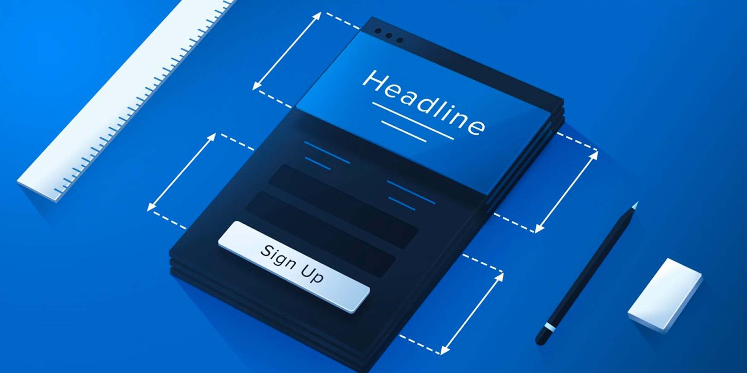
In the infographic below, we look at the most common elements of a high converting landing page and what you should be included when looking to funnel traffic into sales. Whilst there are industry-specific elements that you should research for your own business, these elements are common to all landing pages and incorporating them will help boost your chances of achieving the desired marketing goal. Without further ado, take a look at our infographic of must have high converting landing page features.
High Converting Landing Page Anatomy
In summary, if your reliance upon a single high converting landing page to deliver the majority of your sales funnel exists, you must focus budget towards this landing page to ensure at least the following elements are present:
- An engaging and click-worthy headline.
- An actionable call-to-action (CTA).
- A short and concise content that is benefit-focussed.
- Relevant and beautiful images.
- A simple lead capture form.
By optimising a landing page for compliance with standard website conventions, you not only ensure that visitors will have a good impression of your site, but also increase the effectiveness of your overall marketing funnel. Take a look below at descriptions for each of the elements mentioned above.
1. Think hard about your content.
Before you begin to think about the structure of your high converting landing page, be sure to devise engaging content and a click-worthy headline to match. After all, you could have the most scientifically optimised landing page on the internet but if your content is garbage then so too will be your lead count.
2. Conjure a compelling hero message.
A hero message is a single sentence or two at most that completely encapsulates your users intent. This should be placed above the fold and followed with supporting imagery or lead form. This message is often all that’s required to prompt action on your landing page.
3. Stick to a single-minded proposition.
When it comes to your content, your single-minded proposition is the holy grail of what you are offering. It epitomises your value and speaks everything that you can deliver for your customer. Keep your page strictly about this proposition and don’t convolute your content with mixed messaging.
4. Avoid long winded content.
Your landing page is not a blog. Whilst you may want to scream about all the benefits of your services or products, you should keep these elsewhere on the website. Keep your content focussed on the reason why a user may have visited your landing page and save the rest for your blog. If you do really have to link out to other pages on your website, be sure to place these towards the bottom of your page. A person who reaches the bottom of your landing is page is considering your services much longer than somebody who will enquire at the very top.
5. Create an actionable call to action.
Your call to action will draw your audiences attention. Think about what you are offering that’s different to your competitors. If your competition is offering a free 30-minute consultation, you should up the ante to 45 minutes or 1 hour. When it comes to creating an effective CTA make sure that you use larger fonts and your brightest colour to catch the users attention.
6. Selecting the right colour scheme.
When it comes to colour schemes, you want to pick 2 colours keeping in mind that white, grey and black are also shades on your website. Your boldest colour should be used for all buttons or call to actions and your lightest colour should be used for information or headings. When we say bold, we don’t mean lime green either. Be sure to keep these colours in line with your brand too!
7. Ensure you include rich media.
Whilst there is an argument that multimedia may be a distraction, we typically find that videos or animated graphics improve the hangtime on your landing page. Let’s face it, very few people are going to land and enquire within the first 3 seconds so be sure to give them a reason to stick around and keep them entertained without a big wall of content.
8. Include trust signals throughout.
Trust signals typically go unnoticed consciously on your website but play a huge part in converting visitors and developing a sense of trust with your business. Whether it be ‘as featured in’ with logos of credible news sources or simple graphics that showcase licences, accreditations or social proof that you’re business is of quality, be sure to sprinkle trust signals around your clear call to actions.
9. Make use of credible testimonials.
As far as testimonials go, people are typically desensitised to short written quotes with a nice stock photo that’s pretending to be Barbara from Glen Waverley. When we say testimonials, we mean high-quality videos or case studies that showcase a real-person, is unscripted and truly talks about something more than ”their service was great”.
10. Use short contact form fields.
Nobody likes contact forms that ask about our entire lives before we can actually speak to somebody in the business. Be sure to make use of concise contact forms that give you enough information to qualify a lead but don’t overpower the visitor your website. It’s a bigger turn off that you may think!
11. Capture leads above the fold.
When you visit a website, the first thing you typically see is the banner and some nice images. With the majority of website visitors never scrolling past this section, you want to be sure to have a strong call-to-action message that encapsulates that visitors intent followed by a lead capture form. Whilst we’ve seen high converting landing pages that tell a story first and then ask for the customers details, the majority of customers are in market for a quick quote or a call back so think hard about what your visitors intent is for coming to your website before deciding where to place your call to action form.
12. Utilise A/B split testing tools.
There is no size fits all when it comes to high converting landing page designs. What works for one industry or proposition will fall short with others. Therefore, we recommend generating a couple of concepts and utilising A/B testing to measure which layout works best. Don’t forget that you can always flip your pages for other landing pages in the future so this initial investment is well worth it!
13. Don’t forget your exit popup functionality.
Sometimes, people need that extra push. If you’re about to invest thousands of dollars into a sleek and high converting landing page then be sure to give yourself every chance of converting a visitor. Exit-intent technology allows you to make one last-ditch effort to convert visitors as they are about to leave your site. So what if some people are offended by pop-ups. They were leaving your website regardless!

Article by
Steven Lord
Steven Lord is an experienced digital marketing strategist with a lust for search. You'll find Steven on the front lines at Digital Next distilling some of our most complex digital marketing challenges or right here on our blog sharing marketing tips, tricks and insights.
Leave A Comment